Singapore Art Week (SAW) 2022
Scope
︎ Visual Identity ︎ Campaign ︎ Print ︎ Digital ︎ Wayfinding ︎ Art Direction
Year 2021–22
Completed at Practice Theory [SG] ︎︎︎


For the 10th edition of Singapore Art Week in 2022, Practice Theory worked with the National Arts Council to devise a campaign identity responding to the year’s curatorial statement of ‘This New World’.
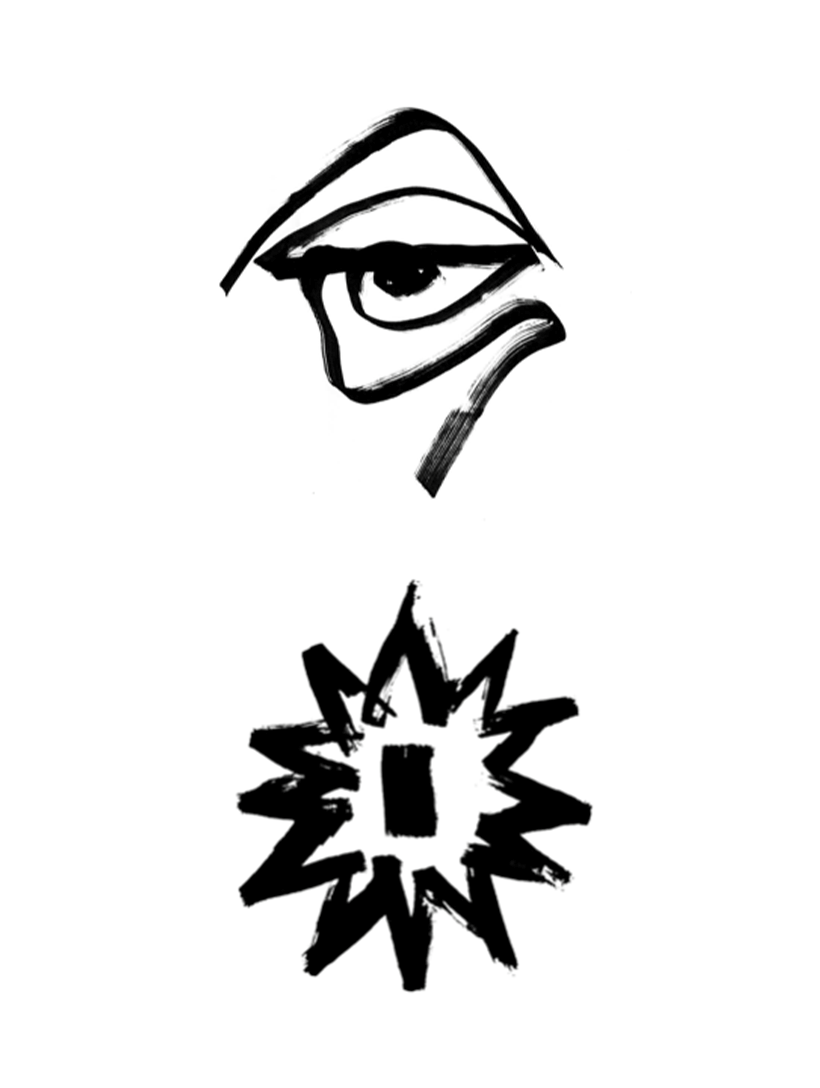
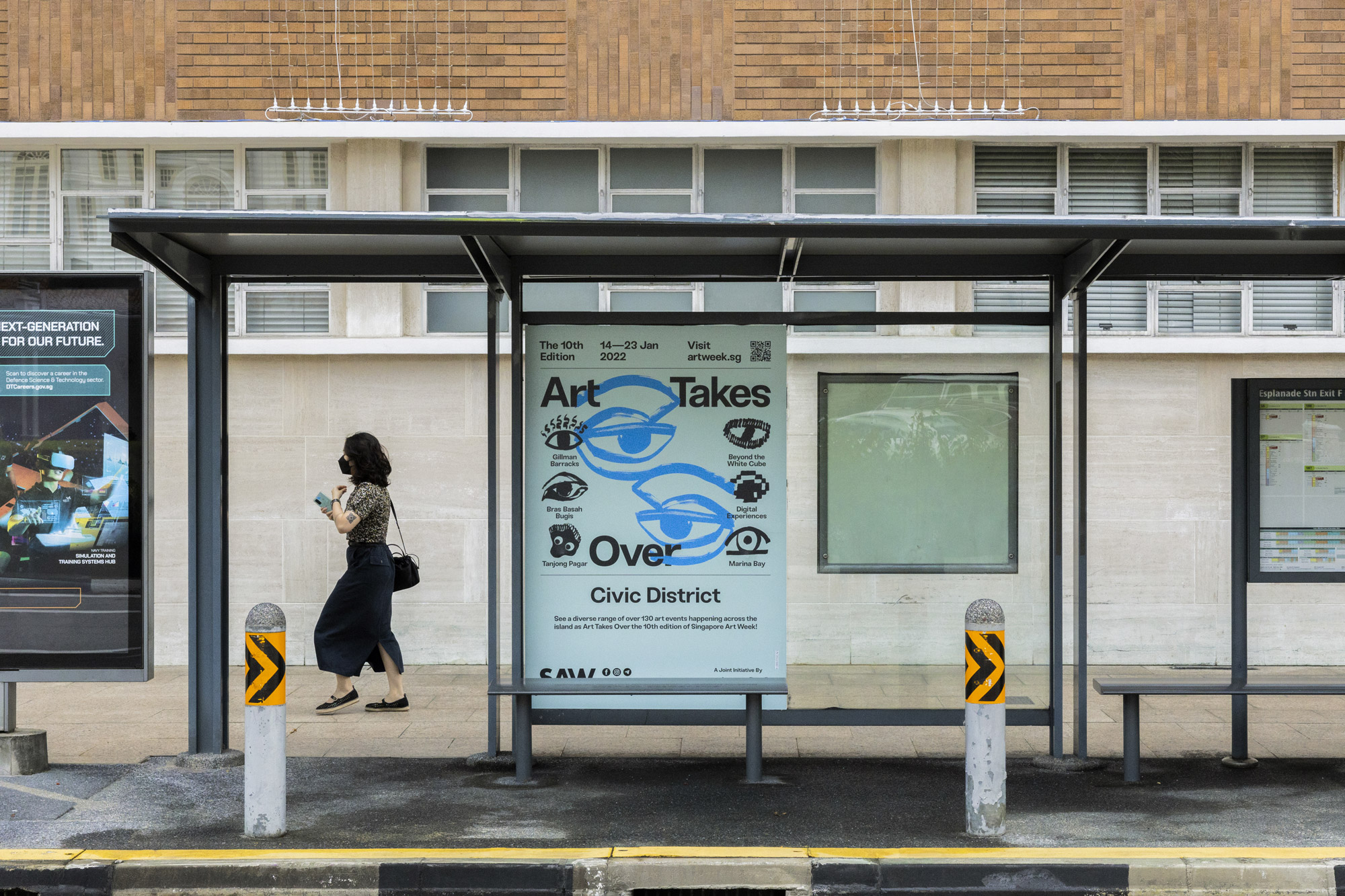
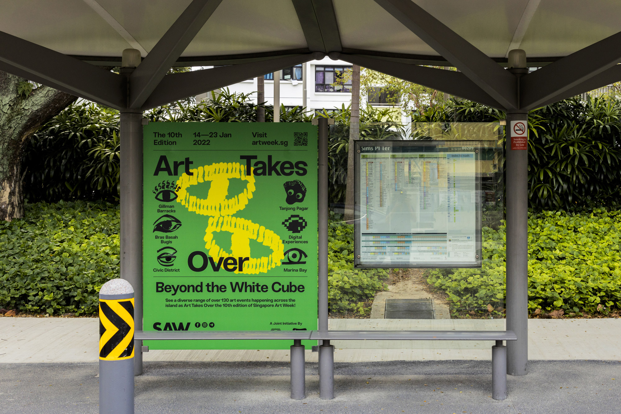
Held in eight precincts nationwide, SAW prompted our design to be accessible to the mass public. Our campaign took the event's literal form of 'SAW' to be 'seen', and referenced John Berger’s concepts of 'Ways of Seeing' for the key visual. We used the precincts of event locations to expand and organise our design, resulting in a unique eye and bold colour scheme for each.
We applied these vibrant sub-identities onto vernacular design applications like their location’s bus stops and lampposts, enabling the decentralisation of the art experience from galleries onto local scenes.

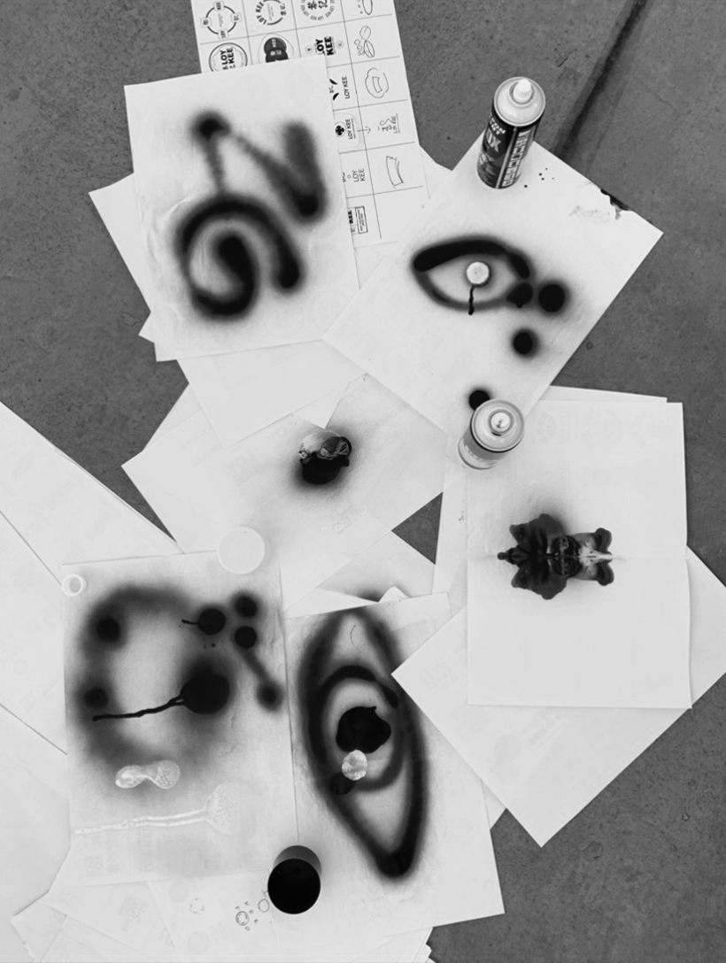
The eyes were crafted with art tools and materials—we explored forms with brush, paint, sponge, and marker before transferring them from paper to screen.
This exploration aimed to complement the event's celebration of artists who adapted to the post-pandemic environment and embraced experimentation with different methods and mediums in their creative process.
The chosen typeface, Sneak by Fabian Fohrer, encouraged our audience to look closer with its small nuances only visible to the keen eye.


In its playful yet sensible nature, our campaign was an invitation for the participation, inspection and introspection of art. It pushed the event beyond the traditional white cube to instigate city-wide activations of art which break boundaries of where and how art can be.
In this vision, everyone has an eye for art.
In this vision, everyone has an eye for art.


Process
—From Start to End
I started this project as an intern in Practice Theory, being part of the team receiving the brief from the client. Through the months, I was responsible for the creative concept and direction used to tender the creative pitch, and was trusted with the project as I continued my stint as a freelance designer after my internship ended.
By the last quarter of 2021, I was fully involved in seeing the identity design to its final artwork. This process included producing out-of-home activations of street lamppost banners, large-format ads in public transport stations, print ads for magazines, to digital artwork for social media platforms which you see above.