WoMMA
Branding the go-to platform for working mothers.
Scope
︎ Brand Identity ︎ Print ︎ Digital ︎ Copywriting
Year 2020
Completed at Temasek Polytechnic

Behind every strong child is a stronger mother. And behind every mother is a community of powerful, ambitious mothers who are ready to embrace and enjoy parenthood.
For young, busy and professional working mothers, WoMMA provides guided professional advice on parenting structured with the sharing of tips and tricks. Helping new mothers progress with similar stages in their children’s growth and journey, WoMMA provides online group support so that more working mothers can experience the benefits of motherhood anytime and anywhere.

Identifying WoMMA
Logo & Brand Story
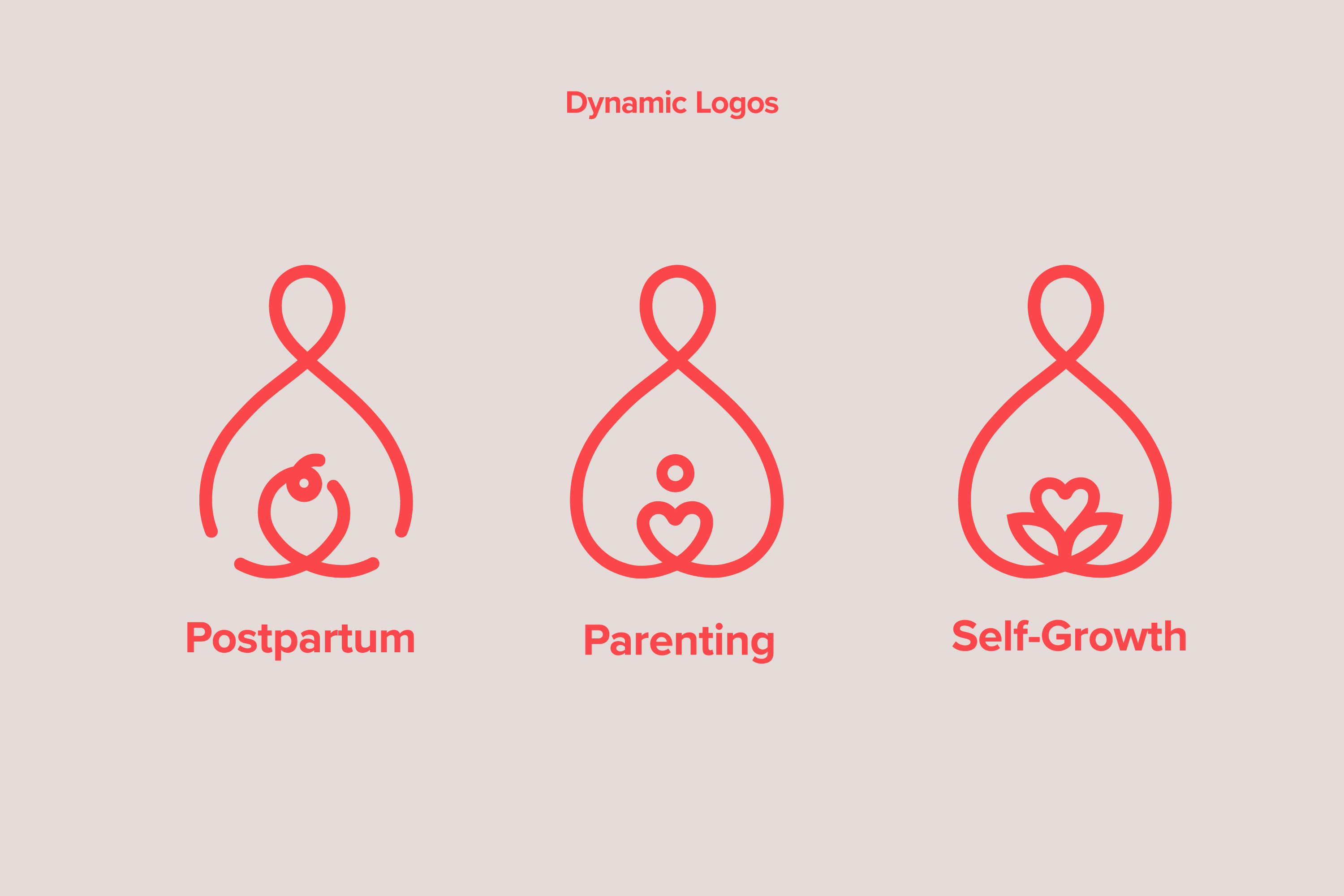
We are a community whose love drives us forward. With a heart intertwined, WoMMA is a symbol of the tenderness and holistic wellness of motherhood that WoMMA helps mothers aim to achieve. Our tagline ‘Growing better, together’ unites us all in the joys and lows of being a mother.
The three dynamic logos reflect the key and various stages of motherhood that we aim to address. The primary lockup is a symbol and wordmark configuration. It is in the horizontal layout, taking into account that WoMMA is mainly a web platform and hence would be better for visibility and layouts.


Styling WoMMA
Brand System Graphics
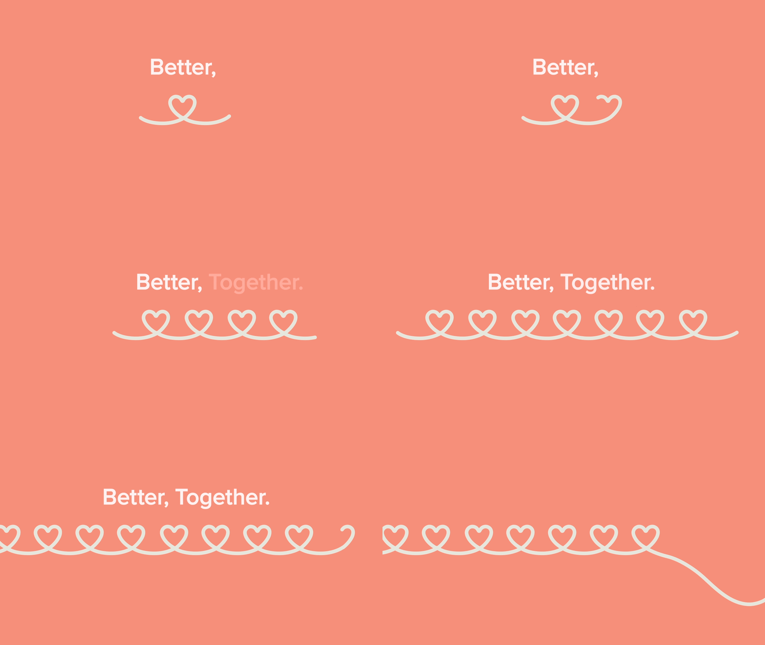
Styling graphics revolve around a linear system which uses fluid, continuous lines to represent the bond between mother and child. It also cultivates the sense of ease of motherhood that WoMMA strives for. Illustrations are freeform with little or no definite form to soften and create an inclusive system.


